
Pro tips if you want to design your own book cover
A little bird told me you want to create your own book cover, so here I am to help achieve the professional look without spending much money and without graphic design skills.

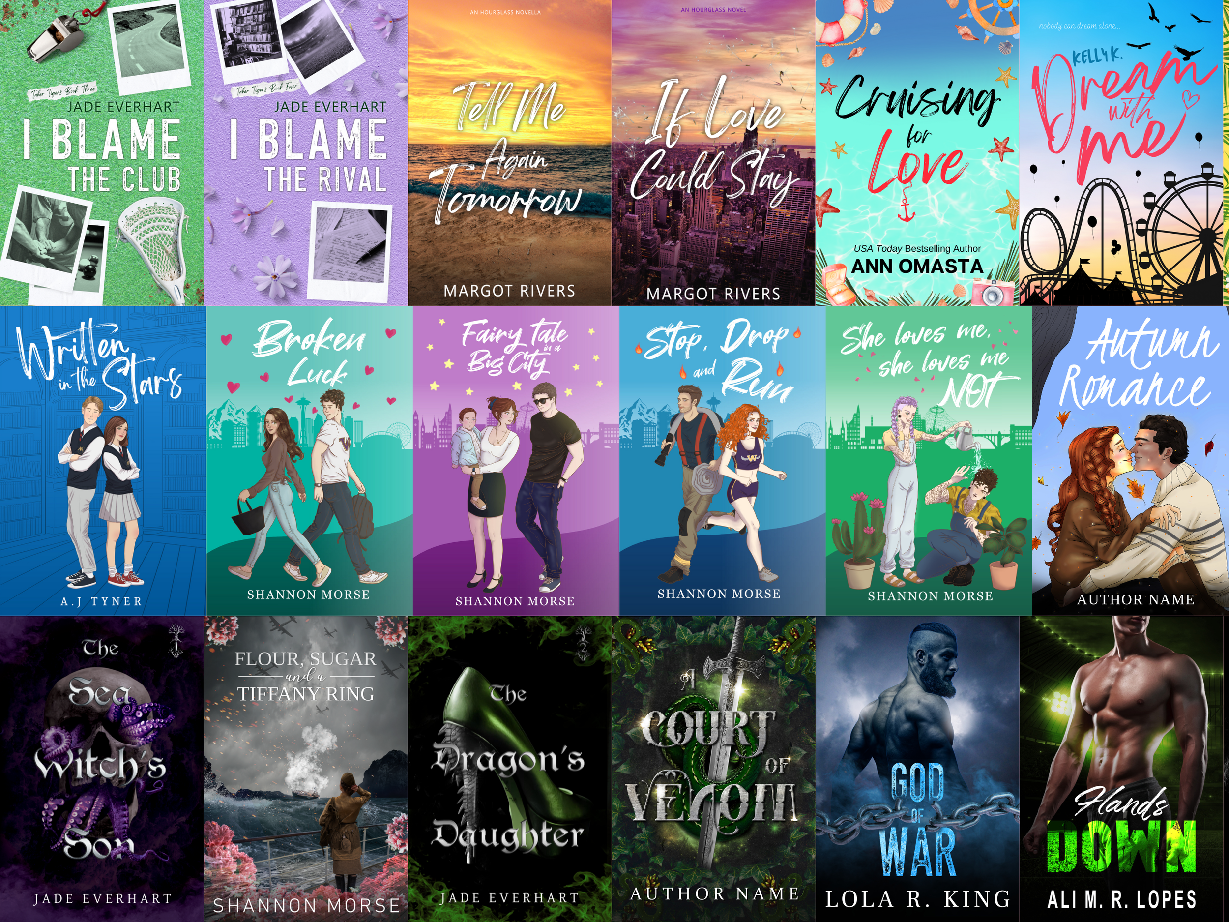
Before we start let me show you a few examples of what I’m capable of creating so you are sure I’m a professional
1. Search the market
This is the biggest mistake I see independent authors make. They want their cover to be original, and even though that is not completely wrong, you won’t get very far by having a cover that doesn’t resonate at all with the books in your genre.
When your potential reader looks at your book cover, they must know straight away what genre your book belongs to.
Otherwise, it will be very hard for the reader to know if your book is what they are looking for.
Let me give you an example:
Let’s say you are writing a dark romance, but you choose to put a flower field with a castle in the background. Whoever picks up your book is probably not going to be the right audience for it, and your perfect reader is not even going to touch your book, thinking it’s not the right type of content they’re looking for.
So let’s keep the originality to the story itself, and when it comes to your cover, try to create something that resonates with the other books in your genre.
2. Don’t add colour to your fonts
If you have no graphic design skills, it’s best if you keep away from colourful titles and blurbs. It might be hard to read, and your potential reader might think you don’t care much about your book, so why should they buy it and read it?
Also, make sure that your title is not merging with the background picture. You can zoom out on whatever software you might be using to edit your cover, and if the title is still readable at a small scale, then you’re good to go.

ps: I would also stay away from skinny fonts for your title. It might be hard to read at a small scale when your potential reader is scrolling through Amazon.
3. Keep the back cover simple
I’m all for creating the most eye-catching book cover, but when it comes to the back, minimalism will be your best friend.
The blurb of your book must be very easy to understand and to see. I would also recommend you don’t make it too long cause otherwise you would have to use a small font, and that might bother the reader.
You might be thinking that I talk too much about the potential reader preferences, but this is the only way for you to make sales. If readers know you have them in mind and you want them to feel comfortable when they are reading your book, then they will definitely come back to you each time you release a new title.
4. The rule of 3
Creating a design that has 3 colours or less will increase your chances of looking more professional. Too many colours might make your book look too crowded and disorganised.
Readers prefer a clean, more minimalist (when it comes to colours) look to the cover, even if it has a lot of elements.
Also, that helps a lot when you just don’t know what else to add to your cover, as long as it is in the same colour palette you were already following, you should be fine.
5. AI-generated cover
It’s best to have the simplest book cover design rather than to trust one AI-generated image. People can tell when a cover was created by AI or not, and with the way things are going nowadays, they might think that your book is also not original.
If you’re worried about having the same stock image as another author, make sure to mix a couple of pictures together.
It is much safer for you to have a reader thinking that they might have seen the same picture somewhere else than a reader thinking that you are creating a book with AI just to make easy money.
These are all my tips for today.
Remember to always have fun. This process should be one of the most exciting ones in your author’s journey.
If the design feels off, you can always start over from scratch. I do that all the time as a professional.
If you liked all of this advice, but you don’t want to create your own cover, you can contact me here